The metering question on Clickin Moms led to a recommendation to use the the zone system. I have read about this before, but I have yet to get my head around it. I am hoping that it will make more sense now that I have a better idea how to use the meter. I will revisit the zone system later in the week but today I was distracted by another comment about using the Kelvin scale to achieve perfect white balance. I was pretty excited about the idea that I could manually adjust the white balance and forget all about my grey card, but I was disappointed to find that my camera won't do it. I think that it might be a Nikon thing. Nonetheless, I got on with a mini white balance project. Bear was busy playing in the kitchen sink when I grabbed the opportunity to experiment with the different white balance settings on my camera. All of these pictures are straight out of the camera with no editing.
This is a white balance reference chart and is used as a guide to choosing your Kelvin setting. (Borrowed from the article linked above).
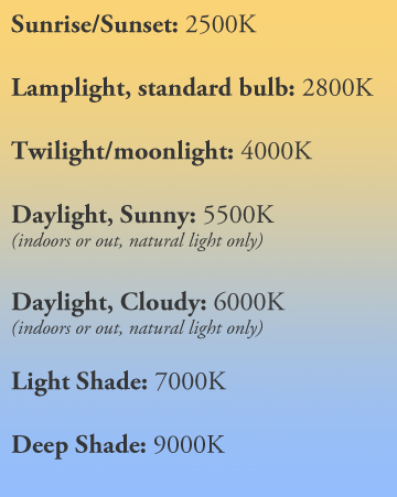
The white balance options my camera gives are Tungsten, White Fluorescent Light, Daylight, Cloudy, Shade and Custom White balance (where you use the 18% grey or white card). They are not in ascending order of Kelvin but I decided to put them in order for the purpose of this exercise. I am interested to see what points on the scale I am missing with the fixed settings.
Here is what I got (excuse my messy kitchen):
Tungsten 3200K
 |
| f/2.8; 1/200; ISO 1600 |
White Fluorescent Light 4000K
 |
| f/2.8; 1/200; ISO 1600 |
Daylight 5200K
 |
| f/2.8; 1/200; ISO 1600 |
Cloudy 6000K
 |
| f/2.8; 1/200; ISO 1600 |
Shade 7000K
 |
| f/2.8; 1/200; ISO 1600 |
From my reading today it appears that you can use either the 18% grey card or the white card to customise the white balance because the camera "can't tell the difference". From my pictures it looks like this may be true as they both gave similar results. Both were much better than the Automatic setting.
Custom white balance using white card
 |
| f/2.8; 1/200; ISO 1600 |
Custom white balance using 18% grey card
 |
| f/2.8; 1/200; ISO 1600 |
Automatic White Balance
 |
| f/2.8; 1/200; ISO 1600 |
It is frustrating that I don't know what Kelvin value the Custom White Balance and Automatic White Balance used. I am guessing that the cards are are something close to the Tungsten - 3200K. The AWB appears much "warmer" and closer to the Daylight setting - 5200K.
I mentioned before that this room has always given horrible orange colours. I now know that the problem was white balance. So many ruined birthday cake pictures! AWB gives horrible results. Tungsten is better here, but doesn't work so well when we move away from the window. It looks like I am stuck with the cards for now. It is useful to see here that they do work. I feel a bit frustrated that I cannot manually set the Kelvin scale because that would be easier, give me more control and help me to get a good feel for white balance.
On another note, managing the exposure was much easier today now that I am using the meter correctly. Noodle!
These were taken a bit earlier in the day using custom white balance.
 |
| f/2; 1/250; ISO 400 |
 |
| f/2; 1/250; ISO 400 |
 |
| f/2; 1/250; ISO 400 |
Comments
Post a Comment