This is a post that I have been thinking about for most of the time I was doing the 365. Whilst I was conscious of my composition throughout the project, it just felt too intense to study it in too much detail. The pace of the 365 leaves little room for much except for grabbing shots as they present themselves. It was a wonderful way to learn how to use my camera, improving my focus and really getting to grips with the exposure triangle. However, I now feel the need to take a step back and think in much more detail about the elements that make a good picture. One of the key elements is, of course, composition.
The main rules of composition can be found in this video tutorial. I could watch this video over and over. It is so inspirational. I thought that it might be a useful exercise to look at each of the rules in this video one by one. I notice that I tend to be more aware of some more than others. It is very easy for me to find lots of examples of some of the rules but I have few representations of some of the others, such as use of colour contrasts. It is time to start balancing that out a little. In addition to the rule shown in the video, I have also thrown in some other compositions that I have enjoyed over the year. I have used examples from my DSLR and iPhone. In fact, since I finished the 365 I have been enjoying using my iPhone as a means to explore composition.
Here we go...
1. Rule of Thirds
The rule of thirds is easily the best known compositional rule and I am aware of it every time I take or edit a picture. Basically you visualise the image being split into three equally spaced horizontal and vertical lines. Then you place your subject on the points where the lines meet.
When shooting landscapes, the horizon should fall on one of the two horizontal lines and not right in the middle of the frame.
2. Leading Lines
Use elements within the setting to draw your eye into the picture. This creates depth. Paths, roads and tracks work really well in this sort of composition but anything will do the job. am still unsure how deep into the picture my subjects should be.
3. Diagonals
Diagonals give the impression of movement within the frame. This is a compositional rule that I don't use very often, certainly not intentionally. I am still trying to figure out which direction the diagonals work best in.
4. Framing
With this rule, you use elements within the image to "frame" your subject. You create a frame within a frame, which is pleasing to the eye and leaves little doubt about who or what the subject is. I sometimes struggle to find good framing opportunities.
5. Figure to Ground/Contrast
Here you use strong contrasts to really make your subject pop against their background. I love very contrasty black and white images, but really struggle to find good examples of this in colour. Good examples of this composition often come from countries where bold colours occur more often in the landscape, such as India or the Mediterranean. Ultimately the UK is known for it's greyness. I need to keep looking though.
6. Fill the Frame
This one speaks for itself. Zoom right in and fill the frame with the subject of interest, leaving no doubt about what it is we are supposed to be looking at.
7. ... but know when to pull back.
Sometimes you need to pull back and let other elements into the frame, enabling them to tell the story.
7. Centre the Dominant Eye
This composition carries a more intense connection with the subject.

8. Pattern and Repetition.
We enjoy looking at patterns and our eyes are naturally drawn to them. As pleasing as it is to see perfect patterns, a surprising interruption creates interest. This is probably the composition that I use least of all. I need to look out for it more.
9. Symmetry
Symmetry is also pleasing to the eye. Even if images are not perfectly symmetrical, it is nice to have some balance there.
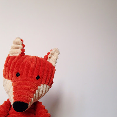
10. Negative Space
Leave lots of empty space in the frame. I really love this one. There is something so clean about it.
11. Shoot from above
I love to get up high and take pictures of the kids from above. This perspective reinforces their small size and vulnerability. I also enjoy capturing the activities they love doing right now because I know that it will be nice to look back on in year to come.
12. Shoot from below
On the other hand, it is also fun to shoot from below. This perspective has the potential to make them appear bigger and bolder in their surroundings.
13. Shoot from floor/table level
I love to get down low and shoot from the floor/table. I usually place the camera/phone on a solid surface which has the benefit of reducing camera shake too.
And that's where I am up to with composition. I am actually surprised by how many examples of each that I was able to find. I want to be more conscious of them in the future and to play more with ones that I rarely use such as diagonals, contrasting colours and repeating patterns.


Comments
Post a Comment